R语言正态分布
发布于 2016-01-02 09:36:27 | 1740 次阅读 | 评论: 0 | 来源: 网络整理
在随机收集来自独立源的数据,所以一般观察到的数据的分布是正常的。 这意味着,在绘制的曲线图与可变的水平轴的值和这些值中的垂直轴的计数,我们得到一个钟形曲线。该曲线的中心表示所述数据集的平均值。 在图中,集值的百分之五十显示平均值在左边以及其他百分之五十显示到图的右侧。这在统计中被称为正态分布。
R语言中有四个内置函数生成正态分布。它们被描述如下。
dnorm(x, mean, sd)
pnorm(x, mean, sd)
qnorm(p, mean, sd)
rnorm(n, mean, sd)
以下是在上述功能中使用的参数的说明:
- x 是数字向量
- p 是概率的向量
- n 是观测值(样本量)数。
- mean 是样本数据的平均值。它的默认值是零。
- sd 是标准偏差。它的默认值是1。
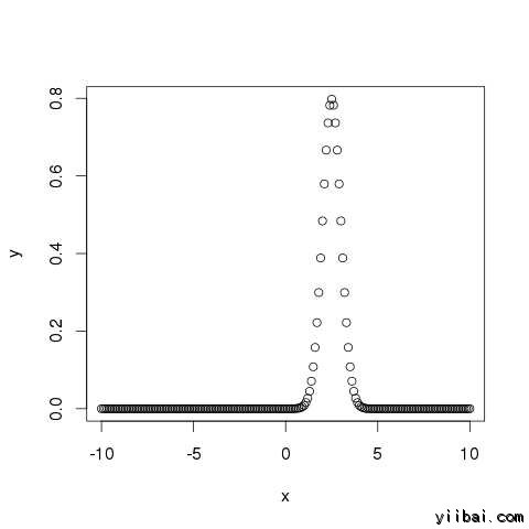
dnorm()
此函数提供概率分布的高度在每个点处对于给定的平均值和标准偏差。
# Create a sequence of numbers between -10 and 10 incrementing by 0.1.
x <- seq(-10,10,by=.1)

# Choose the mean as 2.5 and standard deviation as 0.5.
y <- dnorm(x, mean= 2.5, sd = 0.5)

# Give the chart file a name.
png(file = "dnorm.png")

plot(x,y)

# Save the file.
dev.off()
当我们上面的代码执行时,它产生以下结果:
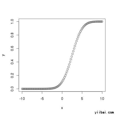
pnorm()
此函数给出的正态分布的随机数的概率是不太一个给定数目的值。它也被称为“累积分布函数”。
# Create a sequence of numbers between -10 and 10 incrementing by 0.2.
 x <- seq(-10,10,by=.2)

# Choose the mean as 2.5 and standard deviation as 2.
 y <- pnorm(x,mean=2.5,sd = 2)

# Give the chart file a name.
png(file = "pnorm.png")

# Plot the graph.
plot(x,y)

# Save the file.
dev.off()
当我们上面的代码执行时,它产生以下结果:
qnorm()
该函数接受概率值,并给出了一个数字,其累加相匹配的概率值。
# Create a sequence of probability values incrementing by 0.02.
x <- seq(0,1,by=0.02)

# Choose the mean as 2 and standard deviation as 3.
y <- qnorm(x,mean=2,sd=1)

# Give the chart file a name.
png(file = "qnorm.png")

# Plot the graph.
plot(x,y)

# Save the file.
dev.off()
当我们上面的代码执行时,它产生以下结果:

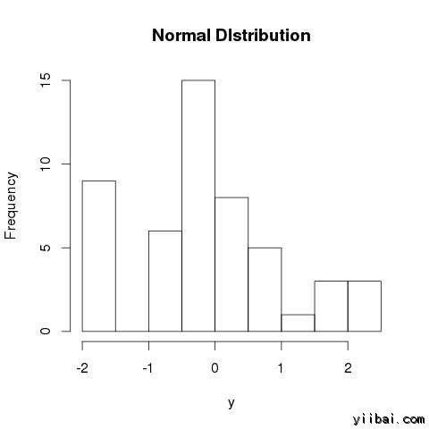
rnorm()
该函数是用来产生随机数的分布为正常。它需要样本大小作为输入并产生许多随机数。我们绘制的直方图,以显示所生成的数分布。
# Create a sample of 50 numbers which are normally distributed.
y <- rnorm(50)

# Give the chart file a name.
png(file = "rnorm.png")

# Plot the histogram for this sample.
hist(y, main = "Normal DIstribution")

# Save the file.
dev.off()
当我们上面的代码执行时,它产生以下结果: